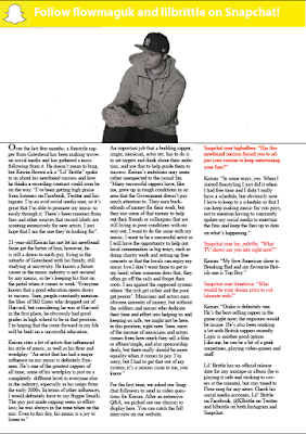
This is how I have set out my interview page featuring my exclusive interview with the cover model. The photo of the cover model in its own small section at the top of the page gives it more exposure. I have included a subtle advertisement at the top of the page promoting the Snapchat accounts of both the magazine and the cover model. The use of the yellow effectively contrasts the black-and-white image directly below it.

No comments:
Post a Comment