I decided to make additional adjustments to this poster. I felt that the title at the top of the page could've been even bigger than it was without affecting any of the other features on the poster. I increased the font size from 72 to 85 and stretched it by an extra 20% to achieve this, and I am pleased with the outcome. I have also added a website link in the bottom-right above the production companies. This further adds to the idea of convergence as it will allow the reader to view extra information about the film through this link.
Tuesday, 19 December 2017
Sunday, 17 December 2017
Friday, 15 December 2017
'The Supply' Magazine Review Page (Step 9)
My next step was to fill in the grey box with suitable information. Therefore, I included the names of several people who contributed in some way to the project, including the cast members. I also created a brief summary of the synopsis of the show.
Thursday, 14 December 2017
'The Supply' Magazine Review Page (Step 8)
For this step, I looked at my original review draft and saw that it needed heavy improvement. This draft that you can see is a new and more detailed version of the review which has more emphasis on specific details and includes a suitable conclusion and summary.
Monday, 11 December 2017
'The Supply' Magazine Review Page (Step 7)
As you can see, I have adjusted the layout of this page in a big way. The box containing the credits and synopsis has been decreased so that it covers the bottom of two columns rather than all three, leaving space for more content within the review itself.
Friday, 8 December 2017
'The Supply' Magazine Review Page (Step 6)
I used the traditional 'Credits and Synopsis' section featured on each review page in 'Sight and Sound' and added it to the bottom area where I had left considerable room to place it. In this box, I will credit people who worked on the project such as the producer, the director of photography and the screenwriter. The director is not needed as they are listed at the top of the page underneath the title.
Wednesday, 6 December 2017
'The Supply' Magazine Review Page (Step 5)
I wrote up my article for this step, while at the same time making sure I left enough space for the next feature at the bottom, which will take up a large amount of room. This article is a first draft and I will most likely make multiple changes to it during the creation of this page.
Tuesday, 5 December 2017
'The Supply' Magazine Review Page (Step 4)
As you can see, I have added a photo to the top of the article section. I have followed the tradition of existing magazines by taking a screenshot of a still from the show. Due to the size of the original image, I have placed it between two of the columns so it is not stretched too much.
Monday, 4 December 2017
'The Supply' Magazine Review Page (Step 3)
For my third step, I filled in the top margin with important information pertaining to the mockumentary: the title of the mockumentary, the country it was produced in, its release year and the director. Putting the title in bold at the top of the page immediately attracts the attention of the reader who is possibly invested in this.
Saturday, 2 December 2017
'The Supply' Magazine Review Page (Step 2)
For the second step, I added a page footer, containing the page number, name and release month of the magazine. This is pretty much compulsory for any magazine; not including this sort of information is criminal and unprofessional. Also, in the top-left area of the page, I have added a 'reviews' indicator in white text within a red box. This is used to make the page stand out.
Thursday, 30 November 2017
'The Supply' Magazine Review Page (Step 1)
The first step for my review page was to create the suitable margins in order to include a title segment, review segment and photo segment. I think these margins and measurements look professional and all of the content can be placed in suitable areas.
Wednesday, 29 November 2017
Sunday, 26 November 2017
Thursday, 23 November 2017
'The Supply' Poster (Step 7)
For this step, I made some slight adjustments to the layout. In the bottom-right, I added some white boxes to the background of the logos that did not have one, to make it look more consistent. I also shifted my title and subtitle up slightly, as there was too much room being left open at the top of the page.
Tuesday, 21 November 2017
'The Supply' Poster (Step 6)
At the top of the poster, I have incorporated a subtitle above the main title. The subtitle reads, "He'll soon learn", which I feel is effective because of the subject of the show. The irony of this subtitle is of course that the children are the ones who are supposed to be learning.
Saturday, 18 November 2017
'The Supply' Poster (Step 5)
The next step was to include the title in a suitable area on the poster. I thought that it would make sense to use the open area of the whiteboard at the top of the poster to place the title in a handwriting format, to suggest that it has been directly written onto the whiteboard itself.
Thursday, 16 November 2017
'The Supply' Poster (Step 4)
I decided that a good background for this photo and scenario would be a whiteboard at the front of a classroom. Therefore, I found a large whiteboard within the school premises and took a photo of it to make it seem more genuine.
'The Supply' Poster (Step 3)
For my next step, I decided to experiment with the image adjustments that Photoshop has to offer. One of these adjustments is called 'Posterise' and immediately caught my eye. This adjustment gives the selected image a comic-book style look, which I think is unique and interesting for my poster.
'The Supply' Poster (Step 2)
The first change I made to my original image was to use the quick selection tool on the background of the image to remove it, which will allow me to place my own background behind the models. I then used the Blur and Smudge tools on the models where their images looked rough, in order to make them smoother and more professional.
'The Supply' Poster (Step 1)
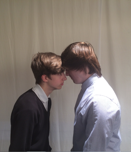
A while ago, I did a photoshoot using these two models, and took photos of them in several different shots and situations. After careful consideration, I chose this photo as it captures the David vs. Goliath style that I have used as my inspiration.
Wednesday, 15 November 2017
Filming Process: Interviews
I have filmed three interviews, one with Mr. Spencer that we will have at the beginning of the short film, and two with pupils who are in the maths class; these will be shown during the maths class scene. I have used the traditional shot for interviews within mockumentaries, the medium close-up. The responses to the questions that they are being asked are designed to be humorous and satirical to match the theme of the short film.
Filming Process: Maths Class Scene
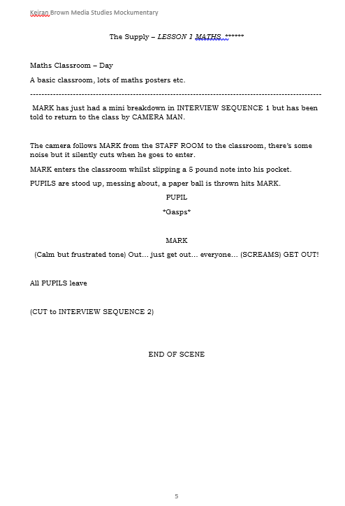
The maths class scene features several different types of shots. A lot of the scene is filmed as if we are looking from the point of view of either one of the students or Mr. Spencer himself, to engage more with the audience. The scene in the corridor after the pupil has been sent out develops the idea of the 180 degree rule as the camera focuses on either the pupil or Spencer using over-the-shoulder shots.
Filming Process: Introduction/Opening Sequence
For the introduction and opening sequence, we filmed many different types of scenes over several days. The introductory scene where we see Mr. Spencer walking towards the school and struggling to find a way in was recorded at a different time compared to when we filmed the clips within the opening sequence, which we then edited together afterwards. I especially like the title sequence showing the name of the short film on the whiteboard with the main character next to it. The extremely serious look of the supply teacher is designed to make the viewer laugh as it is a direct contrast to the intention of the short film.
Thursday, 9 November 2017
Distribution of Roles
For the short film, me and my partner have decided on our roles for the project. I will focus more on the filming aspect while my partner handles the editing process. We chose these roles because my partner is more skilled with editing; he has made several videos for YouTube using the editing techniques we will need.
Tuesday, 7 November 2017
Sunday, 5 November 2017
Friday, 3 November 2017
Wednesday, 1 November 2017
Mockumentary Call Sheet
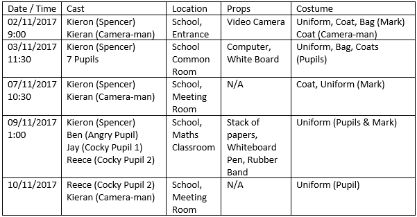
This is a copy of the call sheet that we used during the filming of our mockumentary. As you can see, it displays each individual scene, the filming schedule, its real-life location, any props we need, and also costumes and clothing.
Audience Questionnaire Results
Questionnaire Results from KKelso1
These are the official results of a questionnaire/survey that I conducted amongst a small group of people concerning my mockumentary idea. I asked them whether they found the idea interesting, what the name of the main protagonist could be, their age (to try and determine a primary target audience) and their favourite aspects of mockumentaries.
These are the official results of a questionnaire/survey that I conducted amongst a small group of people concerning my mockumentary idea. I asked them whether they found the idea interesting, what the name of the main protagonist could be, their age (to try and determine a primary target audience) and their favourite aspects of mockumentaries.
Tuesday, 31 October 2017
Friday, 20 October 2017
Sunday, 15 October 2017
Friday, 13 October 2017
Friday, 6 October 2017
Mockumentary Poster Inspiration/Style Model
For my mockumentary poster, I will include a "face-off" picture between the main character, the supply teacher, and a student within the school. For inspiration, I am using this poster/advertisement for the "David vs Goliath" fight between David Haye and Nikolai Valuev because the model that will represent the student is much smaller than Mr. Spencer's actor, and it will represent Mr. Spencer's supposed 'dominance' over his classes.
Wednesday, 4 October 2017
Examples of Camera Shots
Extreme Close-Up
Close-Up
Medium Close-Up
Medium Shot
Medium Long Shot
Long Shot
Extreme Long Shot
Establishing Shot
Noddy Shot (very important in mockumentaries)
POV Shot
Over-the-Shoulder Shot
Tuesday, 3 October 2017
Preliminary Filming
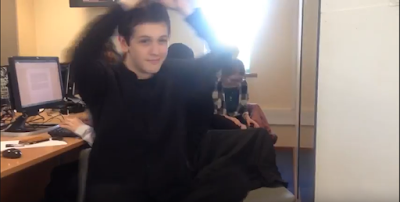
This is the footage from our preliminary filming session. For this video, we remade the first scene from the British sitcom The Office which features David Brent interviewing an employee about his work. We created this preliminary filming to test out suitable camera angles for our short film as well as seeing which technology would be best for filming.
Monday, 2 October 2017
Sunday, 1 October 2017
Subscribe to:
Comments (Atom)


